Your cart is currently empty!
Category: Art Show
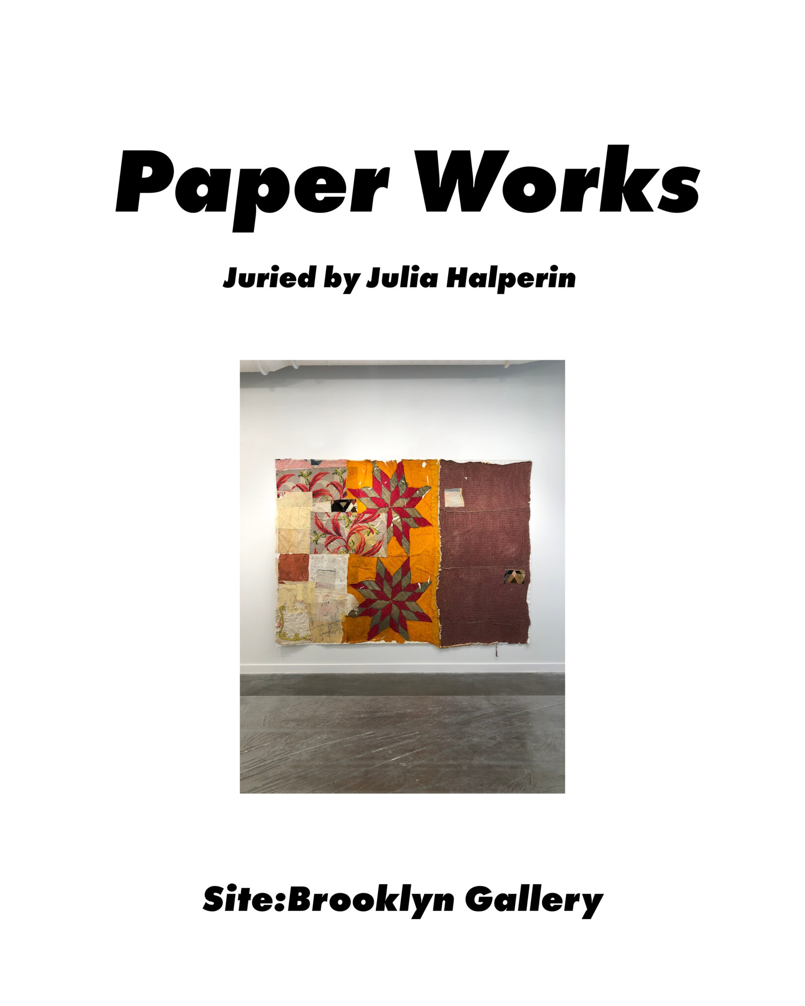
Paper Works at Site:Brooklyn Gallery
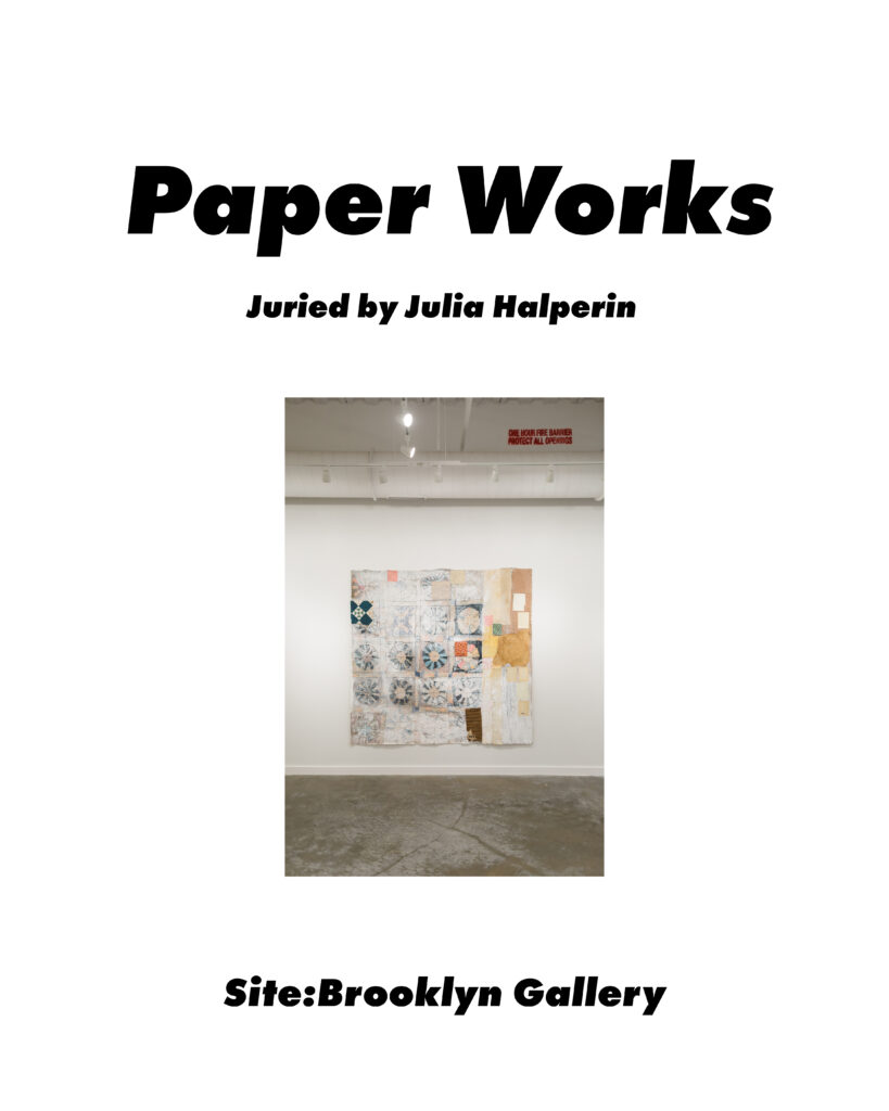
I’m thrilled to share that two of my large paper and textile collages were accepted into Paper Works, an online juried exhibition by Julia Halperin at Site:Brooklyn Gallery. It’s exciting to be part of the programming at Site:Brooklyn and to be included in the thoughtful curation of paper work in contemporary at by Julia Halperin.
Julia Halperin, juror, is a cofounder of the Burns Halperin Report and executive editor of artnet News 2017-2022.
The exhibition is on view April 26, 2023 – May 26, 2023 online at sitebrooklyn.com.
Excerpt from the Curatorial Statement by Julia Halperin
In the art world, paper is often treated like a middle child—it’s underestimated and overlooked. But the material is one of the most versatile ones we have. As the works assembled here show, paper is far more than a tool for preparatory sketches. It can be the main event.
The artists included in this show use paper as raw material for sculpture and other three-dimensional works; they use it to document the everyday; they use it to explore unique cultural histories; and they use it as a means to imagine beautiful, sometimes monumental worlds.
Historians disagree about the origins of paper, but many say it dates back to 200 BCE in China, where it was first used to wrap and preserve tea. From the very beginning, then, paper was used not only to record and retain, but also to make and assemble something new.
In this digital age, we touch paper less and less often. We read books on a Kindle, we write lists on our iPhone notes app, we use credit cards and Venmo instead of paper money. The artists whose works are assembled here remind us of paper’s tactile qualities, its versatility, as well as the distinct role it plays in countries ranging from Korea to Mexico. Allow them to take you on an adventure.
Julia Halperin, Paper Works Curatorial StatementAfter the introduction, Halperin’s writing takes us through each of nine “walls” of the online show, grouping the paper work by theme or material. My pieces are included in the final wall, Wall 9: Paper Collage.
Wall 9: Paper Collage | Collage has a long history stretching back to the origins of Modernism, but each of these artists—Jim Zver, Dana Caldera, and Reinaldo Egusquiza—gives the form a contemporary twist of their own.
Julia Halperin, Paper Works Curatorial Statement
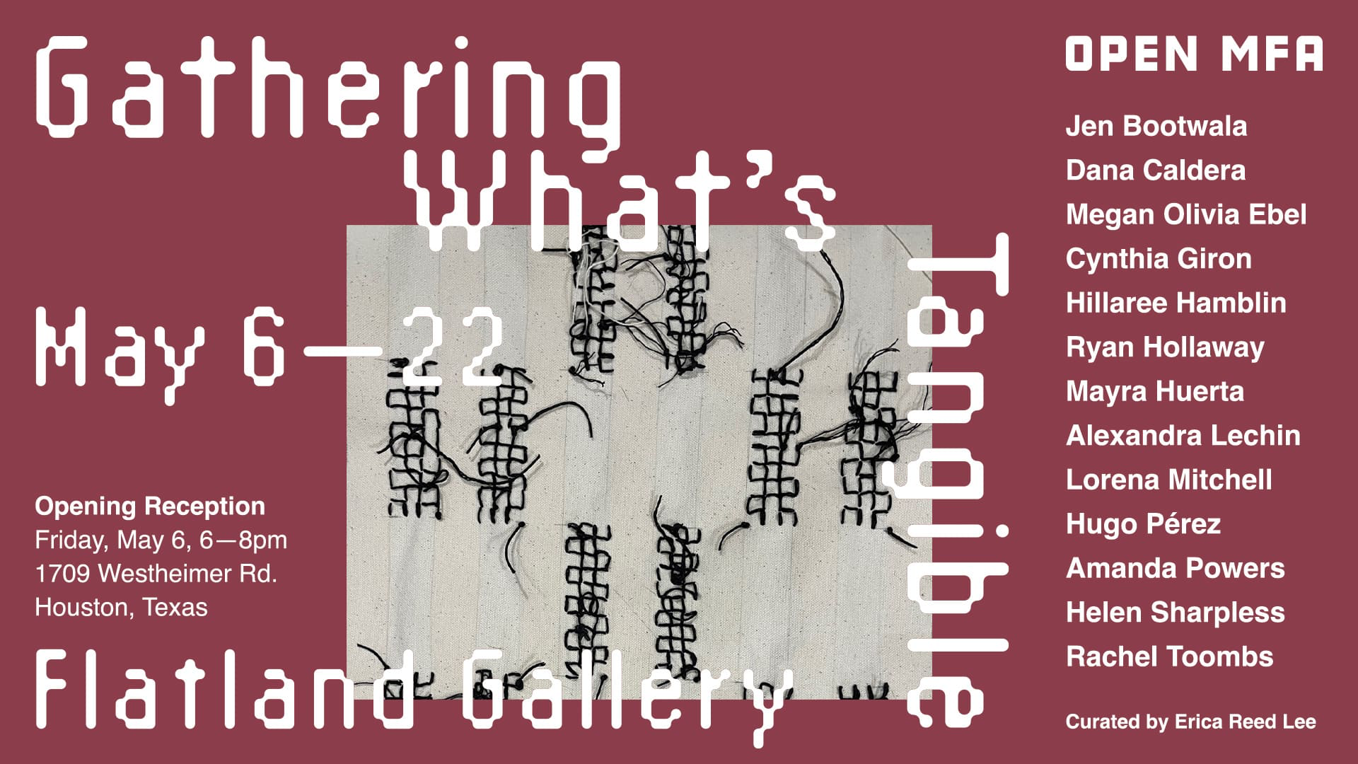
Gathering What’s Tangible Group Exhibition
In May 2020, my collage quilts were exhibited as part of Open MFA’s Group Exhibition, Gathering What’s Tangible. In the curatorial statement by Erica Reed Lee, she describes a trend she saw with artists turning to craft practices during the isolation of the pandemic. I can personally see this in my own work, and in the work of several of my artist friends. Perhaps we craved something tactile, or maybe it was the challenge of learning a new skill.
Exhibition Description from the Open MFA Website
Gathering What’s Tangible brings together Open MFA’s collective response to the pandemic in the form of craft. In March 2020, the pandemic caused Open MFA’s meetings to come to an abrupt stop. Zoom and virtual meetings were a poor substitute for the participatory and energetic events held prior to the pandemic. By fall 2020, Open MFA artists had quietly dispersed. During this time of isolation and anxiety, artists turned towards materiality–many incorporating craft for the first time–as a means of connection and comfort. Open MFA’s inaugural exhibition draws connections between these works and rekindles a community founded on tactile and playful discourse. This exhibition is curated by Open MFA artist Erica Reed Lee.
Curatorial Statement by Erica Reed Lee
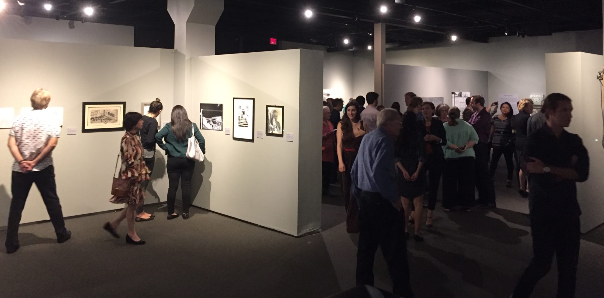
Gathering What’s Tangible opened earlier this month at Flatland Gallery in Houston, Texas. I am incredibly excited about this group show, because it is my first exhibition as curator. Swimming in new waters, I was excited and nervous but kept it together.
The origin of the exhibition, like many things, took place in 2020. Open MFA, a collective led by artists Hillaree Hamblin, Ryan Hollaway, Amanda Powers and myself, had originally booked the venue, Flatland Gallery, for another exhibition called “Collaborations”. The exhibition sought to bring artists together across disciplines to collaborate on new work. I pitched the idea to Dan, owner of Flatland, and we scheduled the opening for June 2020.
With the emergence of the pandemic, we postponed the opening indefinitely. Occasionally life would feel safe, but then a surge of cases would hit. We didn’t host another meet-up until January 2022, and it was only then, nearly two years later, did we start up conversations again about a group exhibition.
At our meetings, I noticed that many of us had experimented with craft and new techniques over the course of the pandemic. Amanda started crocheting plastic bags, and I began making artists’ books. Looking at Flatland Gallery, a Montrose bungalow, I thought about positioning the exhibition as a familial coming together–an opportunity to reconnect, share stories of creative resilience, and establish a strong, nurturing foundation for the collective going forward.
By March, I was still consumed by this concept and proposed that I curate the show. The other Open MFA organizers agreed and offered their support (thank you!).
From there, I reached out to artists and made inquiries about the work they had been making since 2020. In some cases, I made studio visits and met with artists one-on-one to select (and sometimes create!) work for the exhibition. This was the most exciting part of the curatorial process. I enjoyed seeing artists’ studios, discovering work in their archives, and listening to their stories. (Thank you to the artists who opened up their studios to me–it is perhaps one of the most generous gifts to share.)
The writing for the exhibition began in March and evolved as the work came together. My thought process also expanded as I read Craft (Whitechapel: Documents of Contemporary Art) by Tanya Harrod and Thinking Through Craft by Glenn Adamson (Thank you, Hirsch Library!). Only when all of the work was dropped off at the venue did I have a formal curatorial statement. Organizing and installing the work was also more organic than I expected. As the work arrived, I adjusted, fielded responses, and made decisions on the spot. Going forward, I hope to have more experience so that I am not doing this the day before…
Weaving, building, sewing, drawing, and mixing, artists found comfort and meaning in the process of learning and making tactile objects.
Entering the exhibition from the from the front door, visitors will see three textile cherubs directly across the room, a bookcase to the left, and a small wooden table with a large mass of knitted sweaters and two knitted calendars on the wall to the right.
In total, there are 30 sweaters in the pile. Jen Bootwala began making them in April 2020. Each one is distinct–a different pattern, a different set of colors. Bootwala found comfort and connection in the process of knitting. Working with yarn offers human touch, warmth, and purpose. The pile, however, reflects a period of confinement and anxiety. The knitted calendars hanging above the pile mark time and Bootwala’s feverish production. Normally Bootwala would have given sweaters such as these to loved ones, but the pandemic restricted this custom.
Time, like yarn’s presence in the exhibition is a direct result of having made a studio visit with the artist. Before our visit together, I was familiar with Bootwala’s thesis work, having seen it in the UH MFA Thesis Exhibition, but I didn’t know any more about Bootwala’s practice or her experience during the pandemic. After we talked about the knitted works in the show and their commentary on graphic design, we talked about knitting more generally. She explained how she started making sweaters and challenging herself with more intricate patterns during the pandemic. We looked at different ways of presenting them in an exhibition. We also talked about a creating a new sweater: one that could not be worn or one that linked people together. Things were left undecided as Jen chose to think about it. A few days later, Bootwala presented the idea of the calendars and began knitting.
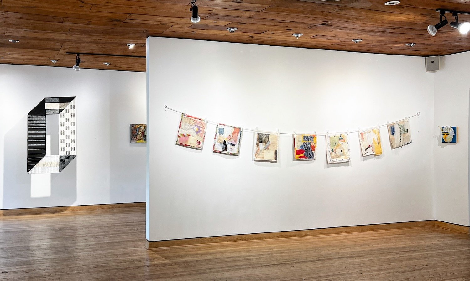
The book shelves host Open Library, a collection of artists’ books made by the Open MFA community. In April 2022, I hosted three artists’ books events with Open MFA. At these events, I introduced the medium and encouraged artists to think about their experiences of home and community during the past two years. We then began making books–either collaboratively or independently. Intimate and narrative in nature, these books, brought together, create a collective history and reflect the community’s perseverance, spontaneity, and willingness to find joy. In contrast to the digitally mediated platforms we have come to depend on, this collection is a physical and tangible connection to shared and personal memory.
Next to the bookshelves are three works by Dana Caldera. Books lay open and exposed–their pages torn from their spines. I placed these works next to the bookshelves to juxtapose creation and erasure/destruction of narratives.
Hanging from the ceiling is a large graphic textile titled Separately Together. Six scraps of canvas are sewn together to create a “0” shaped flag. It is a bold yet meticulous collaboration. Positioned off the wall, the flag creates a dramatic shadow.
Separately Together is the only work that began prior to the pandemic. Alexandra Isabel Lechin and I began working on this piece in late February 2020 in preparation for the Collaborations exhibition. The graphic and visual effects were inspired by Lechin’s practice while the concept derived from my interests. I wanted to understand Texas’s history and the various states that had governed and excluded communities within its domain. Can we mend together its complex, murky histories to create a flag?
The exhibition returns from expansive to personal narrative with Rachel Toombs’s Bread Crumbs: On the Path Home. A young girl, somewhat timid, stands surrounded by an antique frame centered in the middle of an array of mixed media pieces. A slew of fabric, layered materials, and color circle outside the frame. Bread Crumbs presents the artist’s journey back to herself. Collage became Toombs’s primary practice early in the pandemic. Cutting and layering, Toombs pieced together a personal narrative with play and spontaneity.
Turning towards the wall opposite of the front door, the viewer finds The Lonely Cherubs: Apathy, Boredom and Relief above a box of curiosities by Mayra Huerta. Lorena Mitchell’s punch needling was perhaps the most surprising discovery during the curatorial process. An illustrator, Mitchell had previously only shown digital works at our Open MFA events. Like many other artists, however, she began playing with craft during the pandemic. The three cherubs depict the range of emotional responses to the pandemic: apathy, boredom, and relief.
Mayra Huerta’s Curiosities I sits below the cherubs on a pedestal. The box of curiosities contains 12 unique objects made of latex, acrylic, twine, and clay. They are peculiar, surprising and bodily. They could fit in the palm of your hand. Beside the box of curiosities, a typewritten sheet describes the unique stories of each object.
Curiosities I demonstrates Huerta’s recent use of both writing and ceramics. Huerta began writing regularly during the pandemic’s shutdown after creating a writing group with her friends. Creating and sharing short stories with one another, Huerta and her friends used writing as a way to connect with one another. Later, Huerta also began ceramic classes and started playing with that medium as well. While Huerta’s watercolors are also concerned with the flesh, Curiosities I offer a more intimate, tactile, and narrative experience. They feel precious and peculiar–much like our selves.
The final piece in the entry room is a small framed piece by Cynthia Giron. The word “libre” (freedom) is flipped backward, and a butterfly flies upward (or is it falling down? It isn’t clear). The Butterfly Effect offers a colorful, coy prelude to the preceding works.
In the following room, Hillaree Hamblin’s microscopic ink drawings expand outwards on the middle wall. Intricate and detailed, these line and dot drawings reflect the manic, yet beautiful, anxiety resulting from isolation and uncertainty. Like a cloud, they suspend themselves.
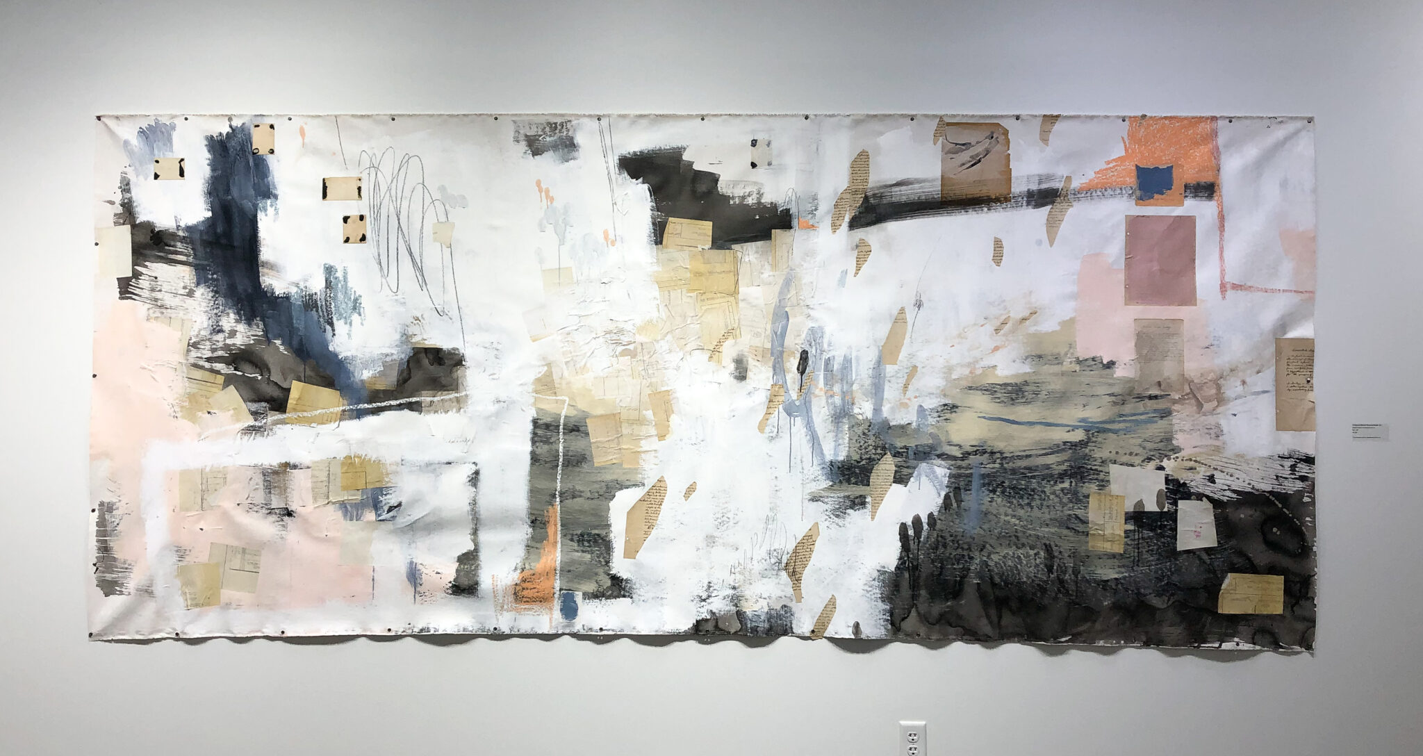
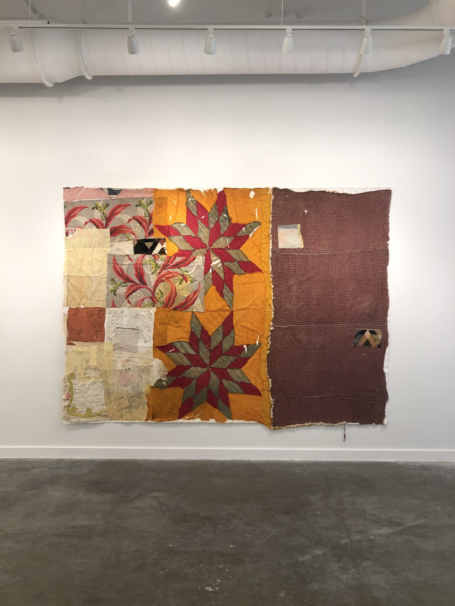
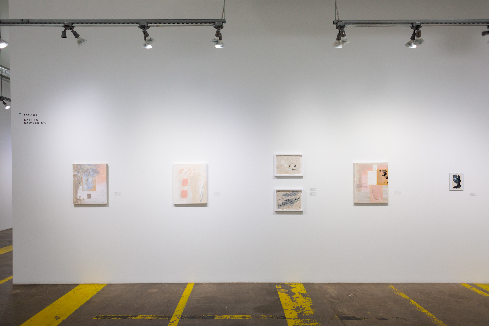
Dana Caldera’s quilt series hangs across the main room’s eastern wall. This newer series of collage work is a continuation of her previous series with the significant addition of the found quilt pieces’ pillowy, cushioned surfaces. Caldera pulls from the remnants left by strangers to create soft yet rough stories that reach and connect the viewer to the human presence of people in the past. Handwriting and images peek through layers of color.
Installation view. Dana Caldera, Collage Quilt Series, Mixed media on found handkerchief sewn to quilt or hand quilted, 2022, 16 x 16 inches. Photo: Amanda Powers. Hugo Pérez’s Loteria card masks frame the back doorway. Tezcatlipoca (Moon God) rises from the left, and Huitzilopochtli (Sun God) sets on the right. During the pandemic, Pérez hosted a small mask-making workshop for his close friends as way of reclaiming the masks they were wearing every day to protect themselves. Prompted by this exhibition, Pérez created a set of masks using Loteria cards which reminded him of his childhood and cultural background. The masks, one depicting the Sun God and at other the Moon God represent duality–a concept Pérez continues to explore in his practice.
Opposite of Caldera’s quilts are Helen Sharpless’s sewn works on stretcher bars and Cynthia Giron’s works on panels. I met with Sharpless over coffee to learn about what led her to sewing and her choice to choose textiles over painting. I am always curious how women learn their crafts in today’s world (in contrast to mid-20th century). Was it passed on to them by their mother’s? How has it influenced their relationships? Does their craft play a role in their identity as daughter or mother?
Unlike me (who just recently built up her confidence to use the sewing machine), Sharpless has been sewing since she was a young girl. She sat nearby as her mother sewed drapes and clothing. Enthusiastic, Sharpless started sewing thereafter. At Rice University, she created a sewn installation that flowed outwards from a house structure.
During the pandemic, Sharpless cut, sewed, and experimented with joining fabrics to create abstract patterns with specific color palettes. At times, the works are large and droop slightly under the weight. In others, the fabric is taught and controlled. As the exhibition continues into the third room, the works become even more probing. In Altered Remnants, cloth pushes forward to create a shaggy appearance, while in New B and Silk Meditation, satiny fabric stretches across to create a mostly smooth surface.
To the right of Sharpless’s Flag Dude, Cynthia Giron’s four mixed media works vibrate outwards. Given more time to reflect and address her own person health, Giron explored nostalgia and kitsch. The first painting, A gathering, presents a dinner table–a place associated with sharing and physical connection. The thing with Space is playfully investigates physical presence and emotional space in the form of a galaxy. FEEL LIKE and La Rata follow these two works by addressing personal reflection and family memory.
In the final room, the visitor will find Amanda Power’s series of crocheted plastic bags, works that derive from the Houston freeze, and works by Sharpless and Lechin.
$2/hour is an ongoing series by Powers. Using the craft technique of crochet, Powers loops together dollar signs from plastic bags–producing at most two per hour. During the pandemic, Powers was particularly concerned with the systems of power present in today’s global society and the social and environmental impact of our everyday actions. Transforming “trash to treasure” the objects evoke a since of resistance and communal empowerment against corporate negligence, while simultaneously questioning the value of money, the impact of over-consumption, and the individual’s role within the economic systems of society.
Lost Time and Power Grids were made during the Houston Freeze (2021). Both works use electrical cords as material and subject matter. Tangled, woven, and twisted, cords are severed, stripped, and cut. Powers describes the works best: “Electrical cords serve as physical remnants of the virtual spaces that, for many of us, sourced our only means of connection and communication during the lockdown. Seen here in these two works—an iPhone charger, ethernet cable, headphones, an extension cable, and additional power cords—these objects are obsolete when electricity is no longer accessible. The cold, blue paintings archive electrical cords as something of the past, while the hand-woven, material objects carry our memories, mending broken structures and reimagining new forms”.
Standing on a podium across Sharpless and Powers’s works, Lechin’s ceramic The Skin We Wear slips and slurps. It is a beautiful, organic black ceramic piece dotted with white. A later addition to the exhibition, I love how the form stands as both shadow and beacon for the tangible and bodily–encouraging viewers to relate the odd and unknown experiences of the exhibition to their own bodies.
When you visit this exhibition, I hope you see and experience the play, solace, and comfort as I did with these artists and these works. Each object is unique, vibrant and wonderfully human.
I am incredibly grateful for these artists and the generosity they shared in the form of their work. Please continue to make, share, and celebrate what makes us human.
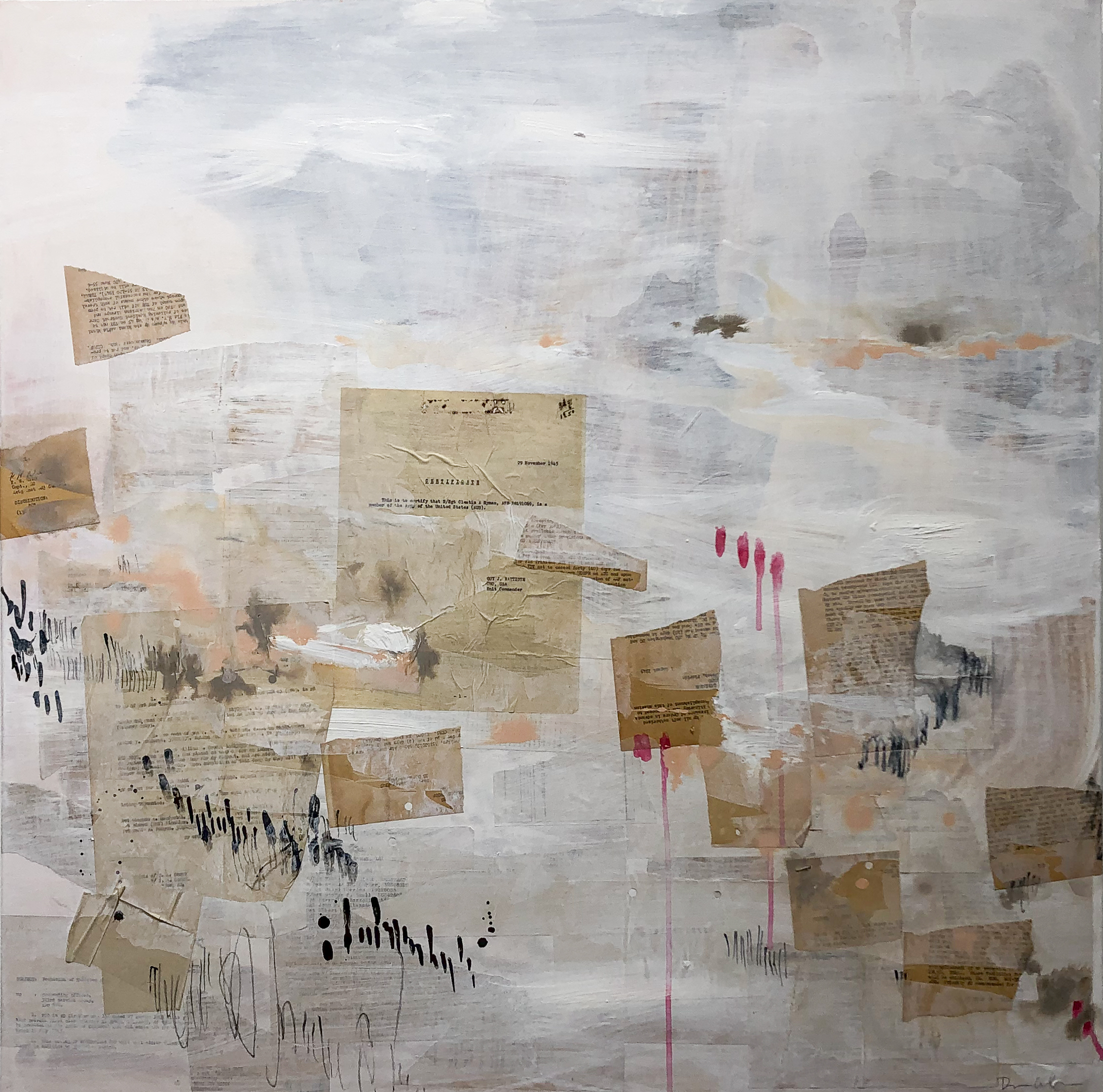
Dana Caldera: Are These Portraits?
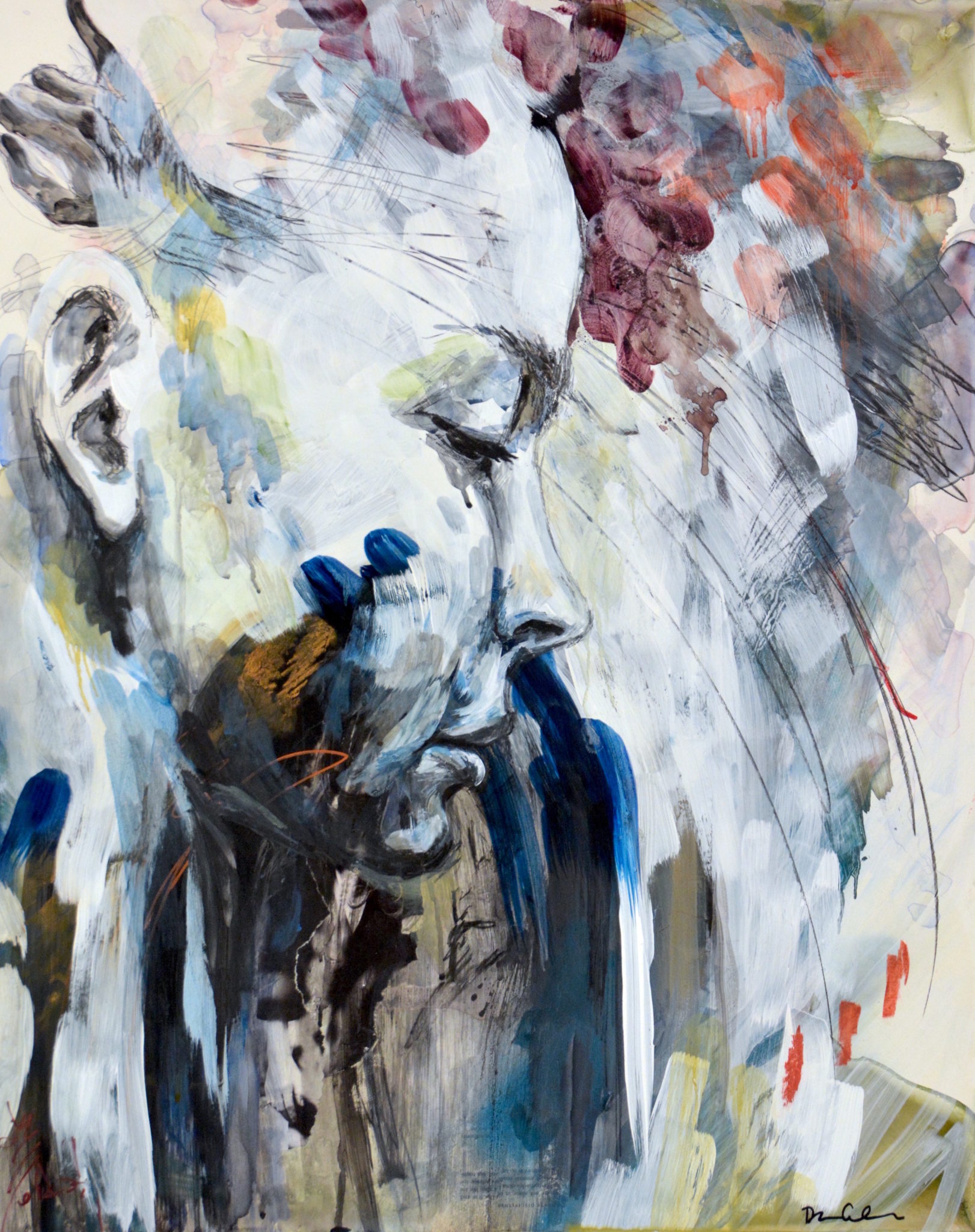
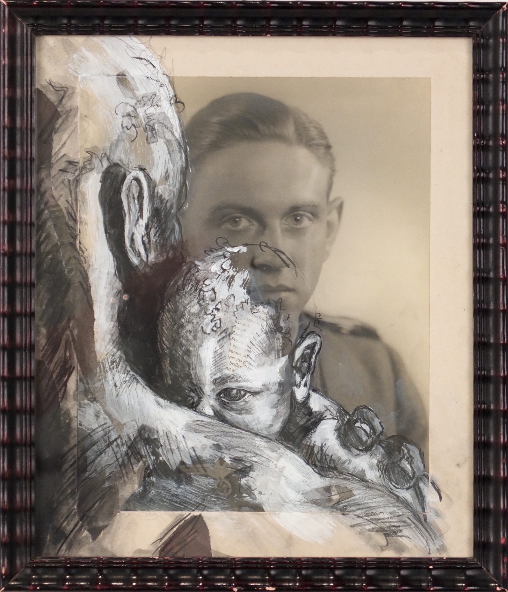
After years of working with found photographs, I found myself drawn to the memories one chooses to keep: correspondence, recipes, books, and notes, the personal records of a life lived. In this collection, these mementos are combined with abstract marks of mixed media, built up in layers over days and weeks. The details unfolded like a conversation as I worked, revealing themselves one layer at a time, much like getting to know someone. I hope that viewing the work feels like the same unraveling of a complex visual story, one that is at once familiar and strange.
Visual Vocabulary
As I worked, I found that a consistent visual vocabulary began to surface. The colors of the work are drawn from the delicate greys and ochres of the aged paper and the black and blue colors of ink, with some additional warming pinks, peaches, and oranges. The marks are controlled scribbles, made with conté or pastel, sometimes loose and other times confined to a shape or overlapping a piece of found paper. I’ve added some new textures to this work, embracing the unpredictability of acrylic ink pooled and left to dry flat, and the playful texture of the oil pastel scrawled on the raw paper, often creating negative space shapes.
Themes
Water, time, and tension emerged as important themes in this work. The use of water was essential to the handmade paper process (the first pieces I made when imagining this body of work) and the abstraction made with the pooled acrylic ink. Working with water in this way was unpredictable and brought the passage of time to the forefront of the work because I had to rest between layers as the water dried. There was an element of relinquishing control. Water represents strength, steadfastness, and cleansing. Over time, a little bit of water is a powerful force.
Time is ever-present. I’m creating new artwork using old material, the layering process of creating the work is time-intensive, and the art needs time to rest between each layer. This gives the artwork a chance to breathe and I get a chance to respond to how it forms. Time is a necessary component of working with the water and adhesives in layers.
As I worked, I was thinking about tension and balance. The construction of new artwork is born from the destruction of the old primary material. The build-up of texture and collage is balanced with the negative space of the simpler compositions. Other tensions present are delicate with playful, new with old, recognition with anonymity.

Questions
Are these timelines?
In a way they are, I’m creating the work from back to front, layering in collage material and mixed media as a new record of this time.Are these portraits?
If I’m not using the likeness of a figure or a traditional face, can they still capture the humanness of a portrait? I’m working with found papers that evoke a poignant nostalgia, and I combine them sometimes haphazardly, mixing stories, mixing years.Who’s story is this?
I’m both honoring the story of the original found object and reducing it to the basic formal elements of color, texture, shape, or line as with any other art media. This work is about all of us and none of us. A combination of abstract and playful mark making with distinct humanness and approachability because we see something of ourselves in the found collage material.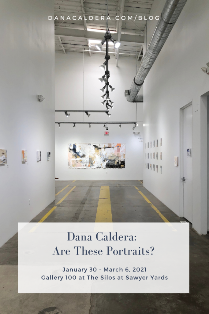

Things To Look For If You Buy Art At An Art Market
‘Tis the season for art markets, craft fairs, and flea markets. The artists and makers are here, ready to sell you beautiful, handmade artwork. But how do you know if it’s worth your money? Here are my tips to help you buy art at an art market with confidence.
Do you like it?
Liking the art is the first and most important thing. An art purchase is a personal choice, there is so much variability in fine art, and we all have our own tastes. What I like is different than what you like, and that is a beautiful thing.
So, we’ve established that you like the art. A lot. Here are some other things to look for.
Is it an original, a limited edition print, or a print?
There is nothing wrong with any of these options, but the difference will significantly affect the price of the artwork. An original will be the most expensive because it is one of a kind. The artist toiled over this artwork, and you are taking a tangible piece of that artist home with you. A limited-edition print is more valuable than a print because there is scarcity. The limited editions will be numbered, and you can see that you will own say 1 out of 50 of that print. Regular prints have no limits on reproduction.
Do you feel that the quality is high?
There is an intrinsic value to a work of art. Does the paper look or feel dense and luxurious? Does the paint appear well applied? Is the canvas frame heavy and robust? Is the artwork sealed?
Look for these markers of high-quality art-making. If the art is high priced, you should feel that the price aligns with the value of what you are buying.
Does the artist speak knowledgeably about their art?
There is also an added value to the artwork that depends on the artist and their experiences. Have they been creating art for years, do they show work elsewhere, or are they in prominent collections? Admittedly, these questions are harder to answer, but you can get a feel for the “validity” of the artist through a conversation with them.
Sure, it might be strange to ask them for their CV, but most artists probably have one handy, or at least on their website. For that matter, check their website. If you are about to spend hundreds (or thousands!) of dollars on a piece of art you just happened upon at an art market, the artist should not be offended if you want to do your homework.
Is the market curated?
The art market that I’m a part of, 1st Saturday Arts Market in the Heights, is a curated art market. This means that I had to apply and submit images of my artwork and website to become an approved artist vendor. Other big art festivals are most definitely curated. But not all are, so that’s one easy check.
Does the artist have a consistent voice?
Emerging artists seem to be everywhere, but when it comes to thinking of art as an investment, you want to buy from an artist that has consistency in their artwork. Might their art develop and change in the future, yes, but you can take comfort in selecting artwork from an artist that has gone through the work to establish a consistent style. These artists are typically further along on their career path and likely to continue to make art moving forward.
Does the pricing make sense?
Do the prices make sense to you? Are the small pieces cheaper than the large ones? Are there a lot marked at a steep discount? This may seem counter-intuitive, but you probably don’t want to see art marked at a significant discount because that means that there is a good chance you will buy a work of art in a series from that artist, and then three months later someone else will buy one for half price. By fluctuating their prices, the artist is changing the market value of the artwork that you purchased. Better to see that the artist holds prices steady or even increases them over time. That’s a good sign for your investment.

PS. I’m so glad you want to buy art at an art market. If you’re interested in collecting, here are some more tips on buying art in my post on Collecting Art 101. So, ready to go shopping this season? Here are the details for the art market I’ll be set up at this weekend.
Saturday, December 7
11 am – 6 pm
530 W. 19th St. Houston TX. 77008

How To Be In An Art Fair: 5 Lessons From My First Fair
In October, I participated in my first artist-centered art fair, and whoa, was it an eye-opening experience. Mostly positive, and definitely a learning opportunity.
First, let me give you a little background on art fairs. Art Fairs have existed in the art world for decades. The famous ones being Venice Biennale, Miami Basel, etc. They bring the elite sellers and buyers of the art world together in one location. The art is stunning, the money is flowing.
Recently, as with all other markets, the art world is seeing a push toward the direct-to-consumer interface. Artists can use the internet and social media to connect directly to buyers. And yes, even art fairs have embraced the direct to consumer trend. Some examples of art fairs where artists represent and sell on behalf of themselves include The Other Art Fair by Saatchi Art or stARTup Art Fair.
I was showing at stARTup Art Fair, which is unique because it takes place in a hotel, and all of the artists are given rooms in which to set up, display, and sell their artwork. You can move furniture around, decorate, etc.
So, here are my major takeaways from my experience and tips I have for you if you are interested in how to be in an art fair.
1. Visit the fair before you participate to determine if it is the right fit for you.
I was given this advice from Jodi Walsh, a Houston ceramicist, and I think it’s brilliant. If you are going to consider spending big money on rental fees and shipping/travel, then you want to make sure that the fair is going to attract the audience and numbers that you are searching for.
2. Shit happens.
For our room in the hotel, we were advised to hang with non-damaging strips. Well, we had a terrible time getting the work to stick on the walls. Most of the art fairs allow you to use nails or appropriate picture hangers, but if for some reason they don’t, then I highly suggest you bring an alternative hanging system. I saw some elegant ones where artists used ladders or false walls. Some of our artwork was damaged because it fell. This was so frustrating.
When talking to the organizers, I found out that this happens to at least one artist in every fair. Shit happens. Traveling with your art increases the likelihood that you’ll experience this, but hopefully, you find that the benefits outweigh the cost of some damage or other bad luck.
3. Get creative with the cost-benefit analysis.
“So…have you sold anything?” This question was asked by all artists that came through the room. We were all curious to know if the others were making sales. When you spend $2000 for a booth/room and still have all of the supply/packing/travel fees, the pressure to make your money back is high. But, the answer is complicated.
Most of the artists I talked to did not make their money back in a clear sales to spend ratio. However, many of them had conversations with likely follow-up sales, made a connection with a curator/gallerist that seemed hopeful, or saw sales from their existing fans based on being at the fair (you can read more about this “for sale” phenomenon in my post about hosting an open studio sale). The promotion of being at the fair, being featured online, and showing as an active artist, are all non-quantitative aspects that you may find valuable.
That said, the cost of doing business in this way is incredibly expensive, so don’t spend money you can’t afford to lose. For clarity, I shared my room with three other local artists, and we were sponsored by a local non-profit arts organization. Our room fees were covered, but we did pay for supplies and other expenses. You should also factor in the cost of your time.
4. Consider sponsorships or other ways to make your money back.
To that end, I have some thoughts about sponsorships that may help an artist make an opportunity like this financially viable. I think it would be interesting to see artists create and sell merchandise to help pay for their booths. Artists could also look to be sponsored by a brand or company where you sell that company’s merchandise and/or present their name as your title sponsor.
Most original artwork is selling for hundreds or thousands of dollars, and your Average Jane doesn’t come strolling through a fair expecting to spend that kind of money. Make sure you have some small, affordable artwork or prints for sale so that Jane can take something home for $50 or less.
5. Bring help or partner up.
After this fair, I will never set up to do something like this alone if I can help it. When I was preparing for the event, I had all these great thoughts about networking with other artists and meeting new people. In reality, I hardly ever left the room. Most artists seem to feel pressure to be present to represent their artwork and be there in case that special person walks through. Thank goodness I was sharing a room with other artists so that we could take turns covering our space while the others got a chance to look around, meet other artists, and generally take a break or eat our meals!

Concrete & Adrift: On the Poverty Line
Concrete & Adrift: On the Poverty Line: Press Release. Text copied from Alexandria Museum of Art website.
An invitational exhibition featuring regional and national contemporary artists addressing poverty and homelessness. Pairing with AMoA’s exhibition showcasing beggars in Rembrandt’s history etchings, contemporary American artists share the first floor gallery during the Spring exhibit period in Concrete & Adrift: On the Poverty Line. This exhibition was juried from over 200 regional and national submissions, and features 39 contemporary artists from around the United States, working in a variety of media. Concrete & Adrift confronts a number of issues facing those in poverty and homelessness, two subjects that are often underrepresented and misunderstood in our society today.
“Poverty may not mean what you think. The federal government updates its official measure of poverty each year, a measure that’s easily accessible and widely used. Unfortunately, it’s largely meaningless. The reality is worse than the official numbers. Just how poor does someone have to be in order to live “in poverty?” The answer to that question ought to consider what it actually costs to live these days. No frills, no luxuries, just breaking even with frugal living and careful money management.” – David T. Britt, United Way of Central Louisiana
Throughout history, artists have used their craft to attempt to document and make sense of the world around them. The artists in this show do just that, though their subject is one which many overlook or choose to ignore. According to recent estimates, approximately 40 million people live in poverty and a greater number are barely above the poverty line. Everyone encounters at least one person living in poverty or homelessness daily, whether they notice it or not. Poverty and homelessness have been issues for hundreds of years all over the world and are issues that everyone encounters daily whether or not they experience it firsthand. Sordid & Sacred and Concrete & Adrift both show the topic from two far separate historical periods, and in different styles.
“I learned a lot from the works submitted to the call for artists. I had certain ideas about the subjects I expected to see reflected in the works. Once I began reviewing the work, I was compelled to broaden my thoughts on the subject, including but not limited to immigration, gentrification, and artists who struggle themselves. The works in this exhibition prove that beauty can be found in some of the most unexpected places….and faces.” – Catherine Pears, Executive Director, Alexandria Museum of Art
In this exhibition, AMoA worked with artists to bring the discussion to the forefront. Exploring ideas of feeling invisible, overlooked, misunderstood, and more, those living in poverty and homelessness experience difficulties far beyond the financial. This exhibition strives to bring some of those issues to light and confront some of the associated stereotypes and generalizations. Some of the artists work from their own experience and memory, having experienced these issues firsthand. The exhibition is separated into thematic sections: Portrait; shelter; isolation & invisibility; poverty, immigration, and food; and location although multiple works address more than one theme. Each object label includes an explanation or story connected with the creation and meaning of the work in question.AMoA has partnered with area organizations that help those in poverty throughout the exhibition as well in hopes to aid those struggling with poverty in homelessness beyond simply bringing the issues to the forefront. During the exhibition, AMoA will hold a number of events, including film screenings, an artist talk, and a panel discussion to further connect the art with the issues it confronts.
Visit AMoA from March 1 through June 22, 2019 for this exhibition and its associated events!
Exhibition CatalogExhibition Catalog 
Lanecia Rouse Tinsley: With In/Out
In this blog post, I’m writing from the position of a curator for the first time. I am so pleased to present the work of Lanecia Rouse Tinsley as the first art show at Forth and Nomad Gallery. With In/Out is on view until June 30, 2019. Her artist talk is this Thursday, June 6, 2019, at Forth and Nomad.
I first met Lanecia in the dark days following Hurricane Harvey in Houston. My home and my family were spared from the water and in the week following the flood, while Houston started to address the damage, my husband and I looked for ways to contribute. A friend told me that the studios at Hardy and Nance had flooded and they were asking for volunteers to help clean out the artists’ spaces.
We found ourselves working alongside Lanecia in her studio, sifting through piles of supplies and artwork, saving what we could, but mostly sending her hard work to the trash. I was impressed at the time, by her resolve. She stood steadfast, directing strangers to discard the contents of her studio and diligently documenting the items as we marched them out the door.
Lanecia’s quiet and steady demeanor made an impression on me. As our friendship has strengthened over the last two years, I’ve continued to observe a groundedness in her. While she smiles warmly and chooses to listen more than speak, her art tells her story.
Lanecia’s artwork is known for subtle manipulations of color and texture applied through a variety of material. Heavily influenced by abstract expressionism, she paints emotions into her art, building up layers that represent the landscape of the human condition.
In this body of work, Lanecia uses the raw materials of the earth: dirt, clay, fiber, wax, and sunlight, to bring visual expression to her journey through grief. She introduces cyanotype printmaking to combine her photography, words, and nostalgia.
Her art deftly unifies soft and hard; balancing the contrast between the ethereal memories in her cyanotype prints and the raw moments in her textured paintings. Her process is deeply personal, and yet, as you spend time with the marks, textures, and visual components in the art, you are reminded of your wanderings through life.
With In/Out artist talk is Thursday, June 6, at 6:00PM at Forth and Nomad in the Houston Heights. You can find more information about Lanecia and her artwork on her website here.
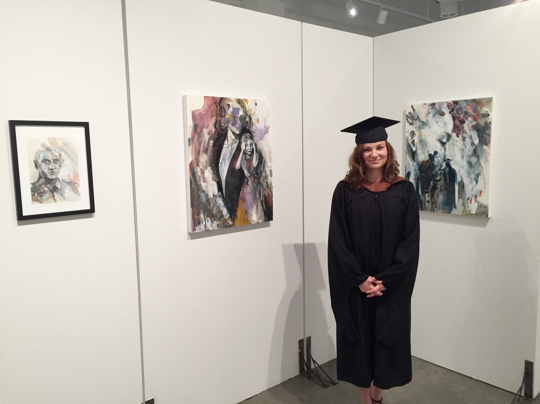
MFA Thesis Statement
My art is an investigation of humanity and relationships. I use mixed media to explore the human condition, especially as it relates to our interaction with others. I overlap the figures, varying the media and the size, so that one is left questioning how the people in my work are meant to interact with each other. Through the application of a large variation of media, including but not limited to: collage, photography, oil paint, acrylic paint, gesso, gouache, pastel, charcoal, graphite and ink, I approach the serious questions I have about the human experience through playful exploration.
The process of creating the artwork proceeds from a balance of discovery and destruction. The artwork begins with intuitive color washes that come to be human form as the artwork develops. By the time a work is finished, the original figure has likely been destroyed, making room for other figures that are unveiled in their place. Each of the layers leaves an impression as I add and subtract media, building the piece to its fruition. Hints of underlaying figures are as integral to the message as the bold figures that stand out in the foreground.
The artwork, Marie (2016), shows a complex layering of figures such that the bold profile of the young woman is interrupted by the underlaying silhouettes that show from beneath her. There is the suggestion of at least two other forms that can be identified by the remnants of hands, one drawn in the top left and one collaged into the bottom center. The hands lead to wrists that seem to disappear behind Marie and lead us to wonder about the story she is telling us about her human experience.
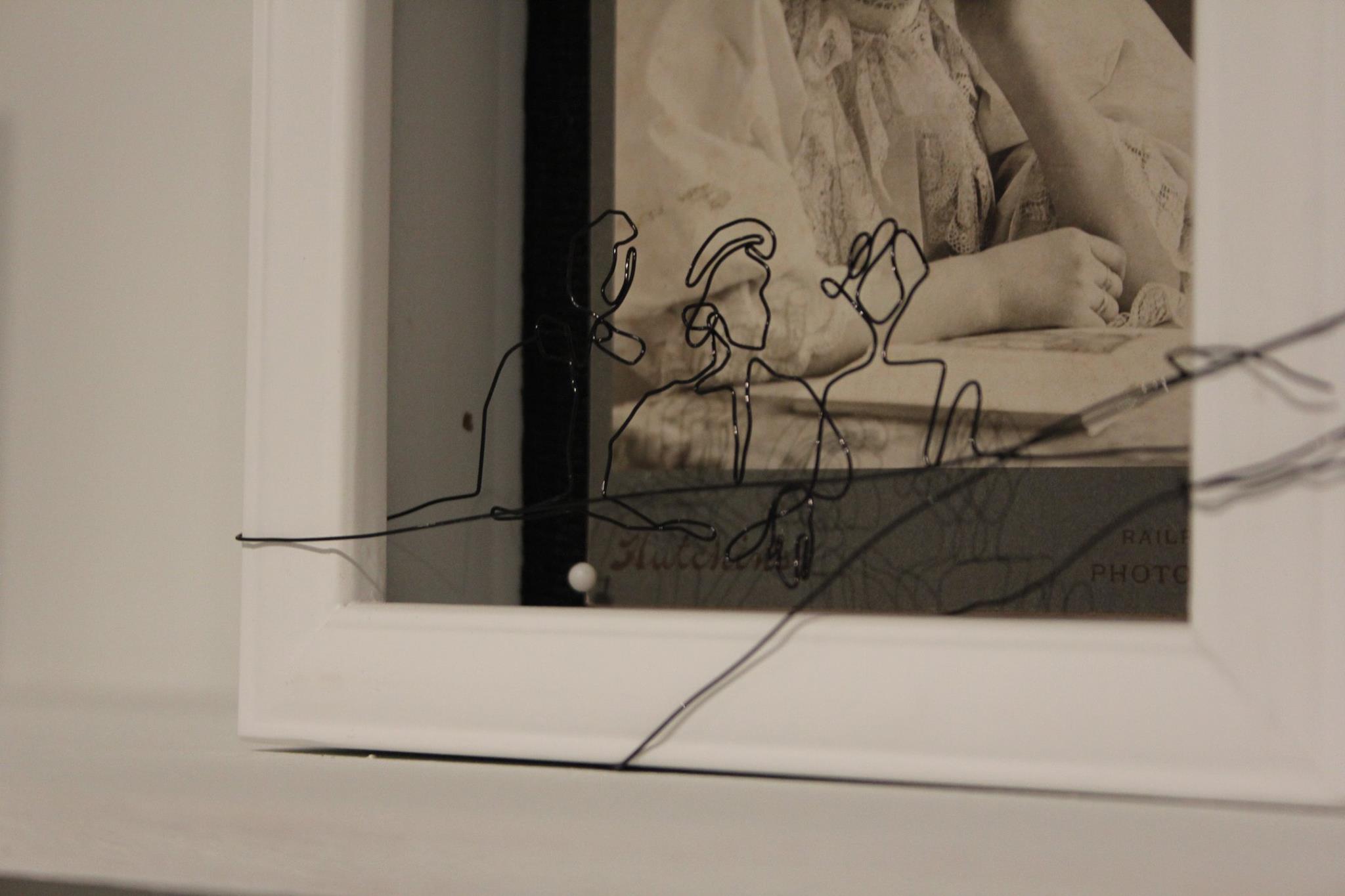
The thematic elements of my work play out in 3 different types of work: mixed media paintings on panel or paper, photo based paintings, and shadow boxes. Each of the series uses overlapping figures to investigate human interaction and the impressions we make upon each other. Whether figures are drawn directly on a photograph as in Father, Soldier, Son (2016) or figures are formed in wire and suspended over a photograph as in Memory Boxes (2016), the tension created when multiple human forms are combined and obscured is present in all of the artwork. Ultimately each piece contains moments of clarity, suspension, and mystery, mirroring the precarious balance of confidence and insecurity within us.
My artwork is characterized by ethereal, transparent layers of color combined with bold line-work. The mark of the artist is evident through brush strokes, drips and scratches. Often, parts of the work are left underdeveloped but for a few marks from the original layers of the piece. The work is expressive, emotional, and vulnerable. The movement communicates a sense of energy and possibility. They are almost playful. One gets a sense that they could join me in my search for understanding of our social relationships.
GENOCIDE: Man’s Inhumanity to Humankind
“GENOCIDE: Man’s Inhumanity to Humankind” Press Release
September 30, 2016 through December 31, 2016
Mincberg GalleryHolocaust Museum Houston’s first contemporary juried exhibit, “GENOCIDE: Man’s Inhumanity to Humankind,” includes 65 selections representing 2D and 3D media. Works featured are from the more than 600 submissions by Texas area artists, with the exception of film and video. 
“Justice for Genocide”
by Leslie M. GuzmánThis contemporary art exhibition explores the suffering humans are capable of bestowing on one another.
“GENOCIDE” is the brainchild of Holocaust Museum Houston’s changing exhibitions committee, including Gus Kopriva, owner of the Redbud Gallery in Houston, and Clint Willour, curator for the Galveston Arts Center. Willour also was the juror of the exhibition. He has served as juror for numerous commercial and non-profit organizations.
The topic of genocide is part of HMH’s mission to teach the dangers against hatred, prejudice and apathy. Through the eyes of each artists’ work, these lessons are reflected vividly, hauntingly and provocatively with the understanding of the brutality and senselessness of such acts.
Inviting artists with ties to Texas inspires collaboration with the museum and further promotes the programs and activities of HMH. Privately donated cash prizes will be awarded for first, second and third place and a catalogue will be produced.
HMH members are invited to a reception from 6 p.m. to 8 p.m. Thursday, October 13, 2016, with opening remarks by Gus Kopriva and Clint Willour at 6:30 p.m. Admission is free, but advance registration is required for this reception. Visit http://www.hmh.org/RegisterEvent.aspx to RSVP online. To renew a membership or to join and attend, visit www.hmh.org, e-mail membership@hmh.org or call 713-527-1616.
Holocaust Museum Houston is dedicated to educating people about the Holocaust, remembering the 6 million Jews and other innocent victims and honoring the survivors’ legacy. Using the lessons of the Holocaust and other genocides, the Museum teaches the dangers of hatred, prejudice and apathy.
Holocaust Museum Houston’s Morgan Family Center is located in Houston’s Museum District at 5401 Caroline St., Houston, TX 77004. For more information about the Museum, call 713-942-8000 or visitwww.hmh.org.